Travel Journal Highlights

Best Travel Photography and Amazing Adventures: This travel photography blog documents my adventures through visual storytelling. First and foremost, travel has always fascinated me.
However, it’s not just about the places themselves. Rather, it’s about the stories, emotions, and memories they create.
I’m Derek. Through photography and drone videography, I capture these experiences in ways words alone never could. Every trip I take has its own narrative. Similarly, every walk I wander tells a story. Additionally, every city street I explore creates unique moments.
For example, there’s the quiet beauty of a misty forest. Alternatively, there’s the shimmer of a hidden lake. Furthermore, there’s the vibrant energy of a bustling cityscape.
If you would like to explore every journey in greater depth, dive into the Travel Journal 2023–2026, our curated blog list of standout adventures. Each year is neatly organised by theme, offering a showcase of travel photography and unforgettable stories—from bustling city streets to serene landscapes—so you can follow our journeys and experience the Best Travel Photography and Amazing Adventures as if you were right there beside us.
Featured Adventures
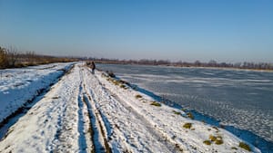
Stunning Frozen Tracks at Czechowice Ponds

Masurian Mysteries: A Week of Sun, Water, and Wheels

Wheels and Winds: A Seaside Holiday in Kołobrzeg

Epic Snowdonia Adventure 2021 Motorhome Trip
Best Travel Photography and Amazing Adventures: Welcome to My Travel Photography Blog
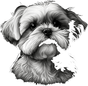
Sharing the Best Travel Photography and Amazing Adventures is even more special because I never explore alone. My wife, Dorota, is my constant companion, and our spirited Shih Tzu, Monty, joins every journey. Together, they bring joy, laughter, and fresh perspective to each adventure.
As a result, we uncover hidden corners of nature and wander vibrant city streets, capturing moments that are both fleeting and timeless. Each experience contributes to the essence of the Best Travel Photography and Amazing Adventures we share with the world.

The Meaning Behind the Moments
Best Travel Photography and Amazing Adventures is more than a collection of images; it is a way of telling stories through every frame. Each photograph is part of a lived experience, capturing moments that spark curiosity, inspire new journeys, and reveal the extraordinary in everyday scenes. This is the heart of the Best Travel Photography and amazing adventures shared here.
From quiet woodland trails and breathtaking mountaintops to the lively rhythm of city streets, every place holds a story waiting to be discovered. As Derek, the aim is to bring these moments to life through the lens, so you can feel as if you are right there within the scene.
If you feel drawn to explore more of these visual journeys, you are warmly invited to delve deeper. Between the lines and images lie hidden stories, creative inspiration, and a world of ideas for fellow travellers and photographers seeking their own Best Travel Photography and Amazing Adventures.

To explore even more of my visual storytelling and projects, you are warmly invited to visit the wider Monty Network. Each site offers a different view of the same shared passion for travel, photography and creativity.
Explore the Monty Network
Monty Network’s Curated Photography, Travel, and Storytelling is a distinctive hub where creative photography, captivating travel narratives, and digital expertise seamlessly come together. Step into a thoughtfully designed ecosystem where every element—art, technology, and storytelling—intertwines to inspire, inform, and empower your creative journey. Here, striking visual galleries sit alongside engaging travel accounts, offering fresh perspectives and immersive experiences from around the world.
The Monty Network not only showcases the beauty and diversity of our surroundings but also provides insightful guides and resources to help you refine your creative and digital skills. Whether you are an aspiring photographer, a seasoned traveller, or simply someone with a passion for compelling stories and digital innovation, you’ll find a welcoming space to learn, connect, and grow. Let the Monty Network be your source of inspiration and practical expertise as you explore new horizons—both behind the lens and beyond.
🎓 Montypix
Discover Montypix Inspiring Travel Photography Adventures, where Derek captures the beauty, emotion, and unique stories of every journey. Through his lens, ordinary moments are transformed into extraordinary visual tales that celebrate the diversity and wonder of our world. Explore inspiring galleries showcasing breathtaking landscapes, vibrant cityscapes, and intimate glimpses of everyday life.
Dive into practical guides and tips designed to help photographers of all skill levels enhance their craft and creativity. Immerse yourself in engaging travel tales that not only document adventures but also share personal reflections and insights from the road. Whether you’re a passionate traveller, an aspiring photographer, or simply someone who appreciates the art of storytelling, Montypix invites you to spark your imagination, fuel your wanderlust, and discover new perspectives. Let Montypix ignite your passion for exploration and help you see the world through a new lens—one unforgettable adventure at a time.
📷 VFML
Best Travel Photography and Amazing Adventures is a vibrant blog by Derek, combining breathtaking photography and drone videography with engaging stories from across the globe. Each post captures the unique atmosphere of both natural landscapes and bustling cityscapes, sharing the emotions and moments that make each journey special.
Dive into the curated Travel Journal 2023–2026, where each entry features standout images, thoughtful reflections, and practical travel and photography tips. Whether you’re a passionate traveller, an aspiring photographer, or simply enjoy discovering new perspectives, this blog invites you to experience the world’s beauty and adventure through Derek’s lens.
Travel has always inspired me—the places we discover and the memories we create along the way. Although I began my photography journey later in life, I now capture landscapes, nature, and vibrant scenes from our adventures. From tranquil lakes and countryside walks to bustling cityscapes and aerial drone perspectives, each photo tells a unique story.
Together with my wife, Dorota, and our Shih Tzu, Monty, we explore the beauty of the world—one step, one paw, and one click at a time. I hope that these images inspire you to get outside, explore, and discover your own special places.
Welcome to the gallery, where every photograph invites you to experience the wonder and diversity of our journeys.
Discover an approachable guide to photography designed for beginners and enthusiasts alike. Photography Made Simple offers practical tips and easy-to-understand explanations to help you get the most from your camera, regardless of your experience level.
Explore step-by-step guides on mastering camera settings, improving composition, using light creatively, and bringing your artistic vision to life. In addition to clear tutorials, you’ll find inspiration through example images and real-world scenarios, making it easier to apply new skills to your own photography. Whether you’re just starting out or looking to sharpen your skills, this site provides both encouragement and expert advice to elevate your photography journey and help you capture moments with confidence.
Unlock the full potential of your business with tailored web hosting, professional web design, and strategic social media marketing. With decades of experience across IT support, WordPress website creation, and digital marketing, I provide reliable solutions that help businesses thrive online.
Whether you need a secure, high-performance website, an engaging social media presence, or ongoing technical support, you can expect personalised service backed by industry expertise. My services ensure your website remains fast, secure, and visually impactful while your brand stands out across major social platforms.
Based in Poland and serving clients throughout the UK and Europe, I deliver results-driven digital solutions to help you grow, connect with your audience, and achieve your business goals.
Travel Journal 2023–2026: A Living Story of Stunning Photography Adventures
📅 2026: Stories Yet to Be Told
This journal grows with every road we travel and every photograph we bring home. Each year’s card is a living chapter, updated as new trips take shape and fresh stories are ready to be told.
Some adventures are already written; others are still on the horizon, waiting to be added when the time is right.
📅 2025: A Year of Wandering
Travel Journal 2025: Stunning Photography Adventures captures a year lived on the move, one journey at a time. Each entry pairs carefully crafted storytelling with evocative images, from quiet moments in nature to the energy of towns and cities along the way.
This evolving collection invites you to travel alongside us through 2025, discovering new places, changing seasons and the small, unforgettable details that make every trip unique.
📅 2024: Moments in Motion
Travel Journal 2024: Stunning Photography Adventures follows a year of journeys captured in thoughtful words and striking images.
Each story reveals a different corner of the world, from quiet, reflective walks to spontaneous detours that became unforgettable moments.
This collection invites you to revisit 2024 with us, seeing each place through a photographer’s eye and a traveller’s sense of curiosity.
📅 2023 and Earlier: Where the Story Begins
Travel Journal up to 2023: Stunning Photography Adventures brings together the early chapters of this journey, where favourite routes, first explorations and formative trips began to take shape as stories.
These entries trace the path from those initial adventures to the present, capturing moments of discovery, learning and quiet reflection along the way.